Where Am I? Helping Users To Find Their Way
By Jessica on
Your homepage is the gateway to the rest of your website. It gives users the first glimpse of what you have to offer, and creates the first impression of your business. That’s why homepage analysis is a vital part of any heuristic evaluation process. As we have mentioned in a previous blog post, users will often make up […]
White Space is a Powerful Design Element
By Jessica on
When designing a website, it can be tempting to cram in lots of information, elements and visuals. After all, your business has lots to offer and you have lots to say. It may seem sensible to make sure your users can see everything together in one place. After all, the content might be useful for […]
What Can Heuristic Website Evaluation Do For Me?
By Jessica on
Boost your UX and ROI with heuristic website evaluation When designing and building a user interface on a website or any other digital product, it’s crucial to consider user experience as well as aesthetics. Users want intuitive, consistent interfaces that make it easy for them to achieve their goals. A positive experience can increase user […]
Creating the Right First Impression
By Jessica on
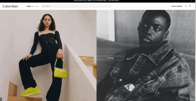
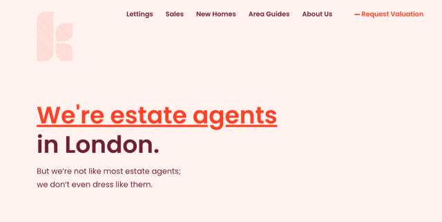
A great first impression and value proposition on your website can help you to reach your business goals. Find out how Heurix can help you with your design audit.


